%20(4).webp)


While account creation and sign-up forms are a sure-fire way to lose sales, converting a visitor into a customer takes a bit more than ensuring you have no sign-up forms or account creation steps in your checkout flow.
Buying things online for nearly years now has made us accustomed to faster and smoother checkout pages. And customers expect the same from renting. The best renting experiences are the ones that fulfil the customer psychology "I want it fast, and I want it now".
What does it take to convert visitors into customers?
Converting visitors into customers is no longer about convincing them that you have something they want, but it mostly boils down to convincing customers to proceed with the purchase.
Convincing customers to proceed with the purchase is often done by:
- Building trust
- Making the user feel at ease
- Making the checkout process as efficient and frictionless as possible
- And learning how to employ remarketing tactics
9 best practices to deploy while building a checkout experience for subscription products
1. Eliminate any price surprises on the checkout page
Problem
According to the Baymard Institute, the shopping cart abandonment rate is as high as 69.8%, and 49% of consumers cite extra costs as the main reason for cart abandonment.
Up until the checkout page, online shopping feels like an experience that most customers enjoy as there is no disruption and no pressure to make a decision. However, customers feel a disconnect between the cart and checkout when they reach the checkout page, mainly due to the price change.
Now, this is not the fault of the vendor/seller but just how the customer journey is designed. If you have a product that lets the customer customise it and add different options, then the total payable price will change if the options selected by the customer have price implications.
Solution
Include options that have price implications already on the product page so that the visitor can play around with the different options and see how it impacts the overall price.
When visitors can play around with the different options and see how the price changes as per their selection, they no longer feel a disconnect between the cart and the checkout.
The need to go to the checkout price to see the final price is made redundant when customers can see the price change beforehand.
For subscription products, multiple options can change the overall price, and to lower cart abandonment, it's crucial that the visitor is not met with these surprises on the checkout page.
Example
1. Dance - Dance is an e-mobility startup that offers e-mobility solutions on a subscription basis. Their customer journey starts on their home page. The visitors click a "Start now" button and are taken to the product page. On the product page, they can select the product of their choice. The price displayed at the bottom left changes as per the visitors' selection.
In the example from Dance, the overall price changes with the product and the subscription type. As the visitor selects a different option, the price changes at the bottom of the page to ensure that the visitor is not met with any surprises.
Image 1: Price change with product change
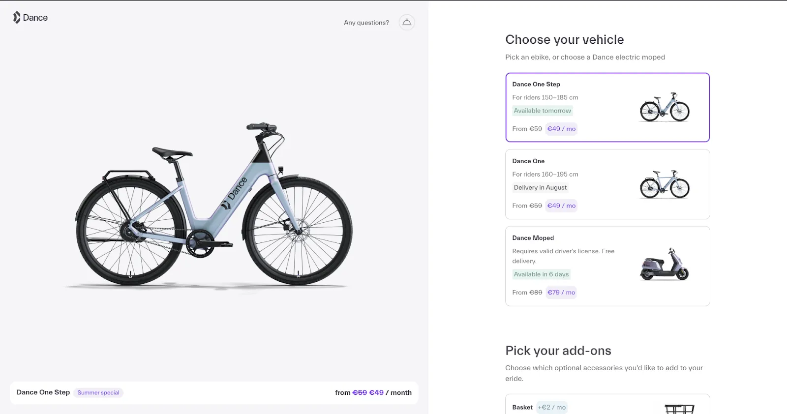
Image 2: Price change with subscription type

Note how the option “pick your add-ons” state whether the option has a price attached to it or is free.
2. Swapfiets - Swapfiets is another mobility startup from the Netherlands. They also display the price changes because of the available option on the product page itself and not surprising the visitor on the checkout page.

3. Stokke - Stokke is a Norwegian company that manufactures furniture solutions for babies and young parents. On their product page they’ve integrated the option of selecting a subscription plan as the subscription plan has implications on the price.
Their visitors can play around with different options and see how the subscription length impacts the overall price.

2. Reduce the length of the checkout form
Problem
As a seller you might be tempted to ask your customers for some extra information while they are already in the process of filling out the checkout form.
But lengthy checkout forms are distracting and often annoy the customer as it keeps them from experiencing their existing purchase and reduces the joy of making a purchase.
Only ask the most important information that you need to process the order and start the subscription.
Solution
You can keep the checkout form short by asking for important information already on the product page such as length of subscription, delivery option, product variant etc.
It is a common practice among subscription businesses to ask for options such as delivery, product variant, subscription start date, subscription duration etc. on the product page itself.
Here’s why you should ask for a certain things regarding the subscription already on the product page:
- One reason for doing so is that some options such as subscription duration, product variant etc., have a price implications. Displaying the price changes already on the checkout page makes sure that the customer is not met with any price surprises on the product page.
- It gives the customer the feeling that they rae in control of their purchase and they feel more confident and comfortable about their purchase.
Example
Strollme - Strollme is a young startup that sells baby strollers and other baby accessories on a subscription basis. Their customer can select a few options such as subscription duration, subscription start date etc. already on the checkout page. The selection of the customer is transferred to the checkout page so that there is no need for the customer to enter the same information over again thus also reducing the length of the checkout form.

3. Use manual input minimisers
Problem
Online shoppers are accustomed to fast checkout experiences. While shoppers spend huge amounts of time in selecting a product they do not do the same while going through the checkout process. When they are only the checkout page, they expect things to be fast and seamless. Additionally due to lack of attention the risk for human error is increased.
Solution
Manual input minimisers are options that the customer can use to automatically fills up the field instead of typing it manually. Commonly used options in eCommerce are:
- Date pickers for birthdays and delivery
- Google places for address filling
4. Display delivery options on the product page
Problem
Another major reason for cart abandonment is unsuitable delivery options. Visitors often proceed to the checkout page to verify the delivery date and check if it works for them. Obviously, they abandon the cart if they are unhappy with the delivery options.
Solution
Add delivery options on the product page itself in the form of a delivery calendar. By adding a delivery calendar already in the onboarding flow, visitors can decide for themselves and in advance when they want the product instead of going through the whole checkout process just to check the delivery date.
Example
1. Dance - Visitors have the freedom of selecting a delivery date from a delivery calendar. They also already collect the address as it makes sense to ask for the address while asking for a delivery option.

Note that the option also states that the delivery cost is free of charge.
2. Swapfiets
Swapfiets providers two options: pickup or delivery. If visitors select pickup then an availability calendar is displayed from which the visitor can pick a date that suits them best. If the visitor select delivery then the visitor is notified that they will be notified via email about the availability of their product and also displays the delivery cost (which is free in Swapfiets case)

5. Skip account creation
Problem
The account creation step is another reason why many visitors abandon the cart as they see it as a hurdle in the checkout process. For the seller, this step is often essential for reasons like repeat purchases, allowing the customer to track the order, giving users access to special offers and so on. For subscription products, account creation makes even more sense because the customer can use their account to control various aspects of their subscription. But that being said, account creation is still among the top three reasons for cart abandonment.
Solution
As a seller, you can still create an account without asking your customers to do the same. The basics of creating an account are name, email and a password. While you already have the customer's name and email, you can easily skip over the password requirement. And this is made possible in the circuly customer self-service portals.
The customer need only know their email to log into their self-service portal. When they log in, a one-time password is sent to the email address, and they can use this password to log in and gain access to their account.
6. Skip sign-up forms
Problem
Visitors hate sign-up forms.
Solution
Kindly move away from sign-up forms and add a checkout solution.
7. Be consistent in terms of branding
Problem
Multiple customers abandon the cart while purchasing because they feel a disconnect between the website and the checkout page. Having this disconnect makes the customer lose trust in the brand, which is an important factor when it comes to converting prospects into customers,
Solution
Stick to your overall brand identity. If you have a brand that already enjoys some level of reputation and recognition, use that to your advantage by incorporating the same branding to the subscription part of your business.
8. Add multi-language support
Problem
Many online retailers do not offer multi-language support on their online shops and stick to only one language (often the regional language). This puts the customer on edge as they must navigate through a shopping experience in an unknown language.
Solution
Before expanding into a new location research your target location and find out what potential languages are spoken in the target location.
9. Provide the right payment options
Problem
Payments and finalising purchase step is still where most customers drop off and abandon their purchase. And this can happen due to multiple reasons:
- Sometimes the visitor feels a disconnect between the checkout page and the payment page leading to doubt and loss of trust in the process.
- Sometimes there are technical issues that prevent the prospect from finalizing their purchase,
- And sometimes, the vendor does not provide visitors desired payment option.
Solution
Before expanding into a new location, research your target location and the most commonly used payment options in that location. Make sure you pick a Payment Service Provider that supports these payment options.
Conclusion
When it comes to converting prospects into consumers, you not only need to have an intuitive site design and fast checkout but also leave no room for surprise. In eCommerce, "the element of surprise" has rather negative implications, especially when the surprise is about price.
%20(4).webp)
%20(3)%20(1).webp)
%20(1).webp)


.png)

.png)


